July 2023
1 Week
House2Home
Curated starter kits for new
homeowners, streamlining the process of turning
Roles
User research & User interface design
Project Type
Design sprint project at Springboard
July 2023
1 Week
House2Home
Curated starter kits for new
homeowners, streamlining the process of turning
Roles
User research & User interface design
Project Type
Design sprint project at Springboard
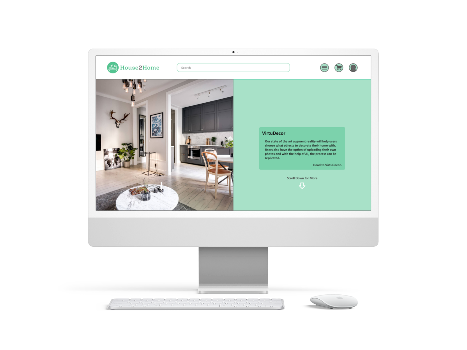
House2Home is a startup that helps users decorate their houses or apartments right after they have just moved in. It focuses on having “starter kits” that contain a group of home décor items that accommodate to the users’ wants and needs. The prices are fairly low since users have just spent a large amount of money moving in.
When first introduced to the problem statement, we were given certain constraints.
Gather information and identify the problem. Create end-to-end experience for users..
Conduct lightening demos. Create Crazy 8 sketches. Design a solution sketch.
Create 5-15 sketches also with solution sketch to create a storyboard.
Create the prototype for the project in Adobe XD.
Interview and test 5 users using the prototype.
Not part of the design sprint, but a day to incorporate feedback and criticism back into the prototype.
These are information given to us in terms of statements made by participants, and a created persona. These help us in figuring out what users would want and need when using the application. It also provides some user research which is detrimental to helping us in our design sprint.
"I moved into a new apartment and it was sooo empty, so I wanted to buy some stuff to make it a little more stylish. I knew I needed a few things, but it was hard trying to stick to a budget"

"I find lots of cool little items that I like, but I never know if they'll all look good together in the same room until I buy them. Usually, I get overwhelmed and end up not buying anything."

"I know the 'look' I want, and how I want to feel when I walk in... I just don't really know what products to buy to pull it off."

"I read a bunch of blog posts on how to decorate a small apartment. They always include 10+ items to buy - which ones should I get if I can only afford three or four of them?"

"I'll admit - I want my place to look good, but I never enjoy searching for decorations or items. I'm not super picky about specific items, so spending time searching for stuff just gets tiring."

"I don't have a huge budget for strictly decorative items, so I want the stuff I buy to make the most impact in giving my apartment the look and feel I want."

"So many items look great in the staged photos - but will they look good in MY living room? You don't really know until you order them and see how they look in the space."

"I do a lot of searching and saving on Pinterest - but the photos are usually of full rooms that I like the look of. For example, I'll see a room with a beach-house theme and save it ... but once it comes down to buying stuff for my place, it's hard for me to pick out the right items."

"I don't want to decorate my place with a bunch of tiny, cheap items...but I also don't want to spend all my money on one big thing. How can I get the look I want within my budget?

"I rent a new apartment every year or two - so, I don't want to commit to buying big expensive items that might be hard to move in the future...and that may not even look good anywhere else."

After going through the user research and looking at quotes and personas, we came up with a couple of " How Might We" questions that are curated to the users' wants and needs. These questions would be answered throughout the week.
How might we help users visualize their homes with the items?
How might we help users decide what to put in their homes?
How might we help users find inspiration for interior design?
How might we help users find the perfect starter kit?
People having recently moved in, might have a bare apartment or house that they might want to decorate. However, they have just spent a large amount on the property, they need cheap but beautiful decoration for their house. They might not have the time or decorative knowledge needed to choose the decorations for their house. There needs to be a way to somewhat assist the process and help solve this issue.
After Day 1, we identified the issues that needed to be solve and we mapped out what users should expect when navigating through our website. Now it is time to move onto Day 2, where we will continue to work on the lighting demos and Crazy 8 sketches
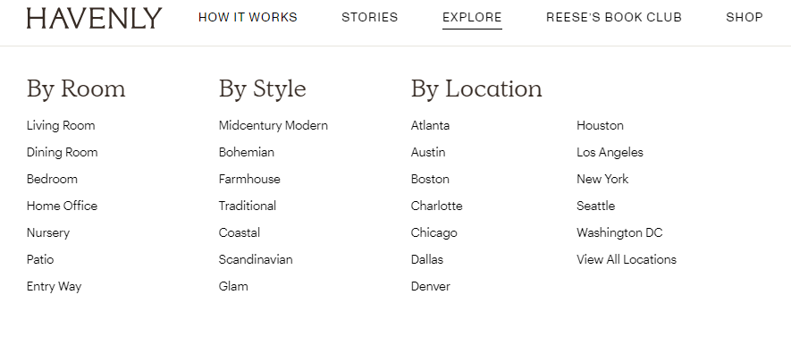
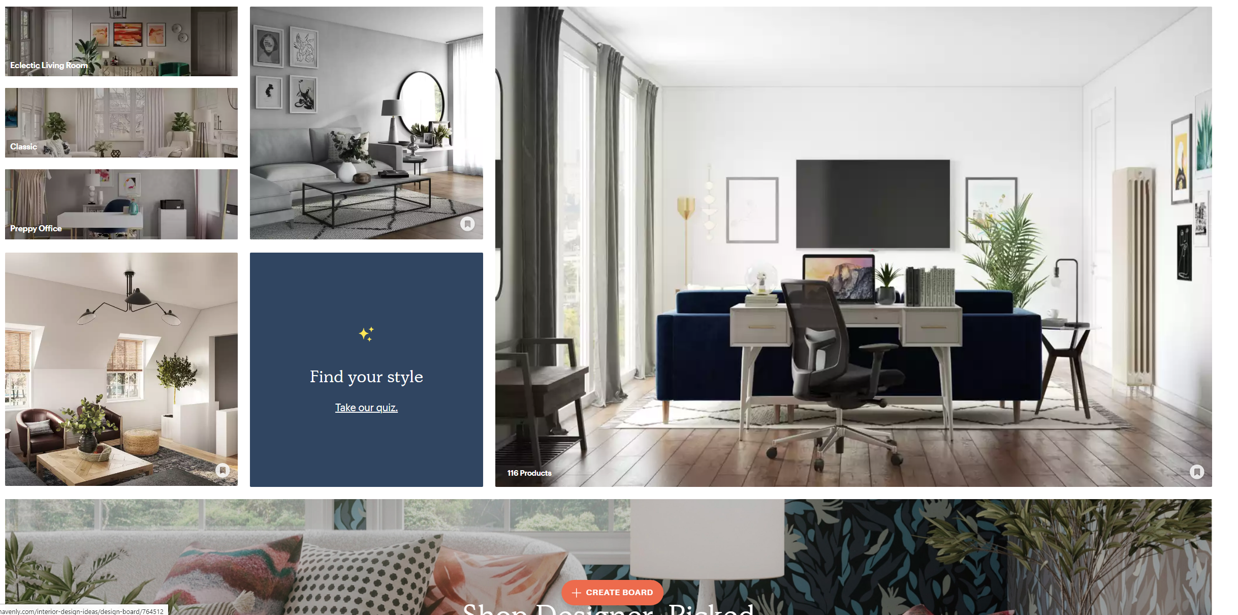
This website is very similar to our idea for House2Home. It has different styles and kits for people to look at. However, this website has many items that House2Home would not have, such as larger furniture, expensive items such as $1,000 lamps. It does have a style quiz and an explore section where people can test for what style best fits them, as well as, look up other styles in the explore page. The website has designers that will speak to you.

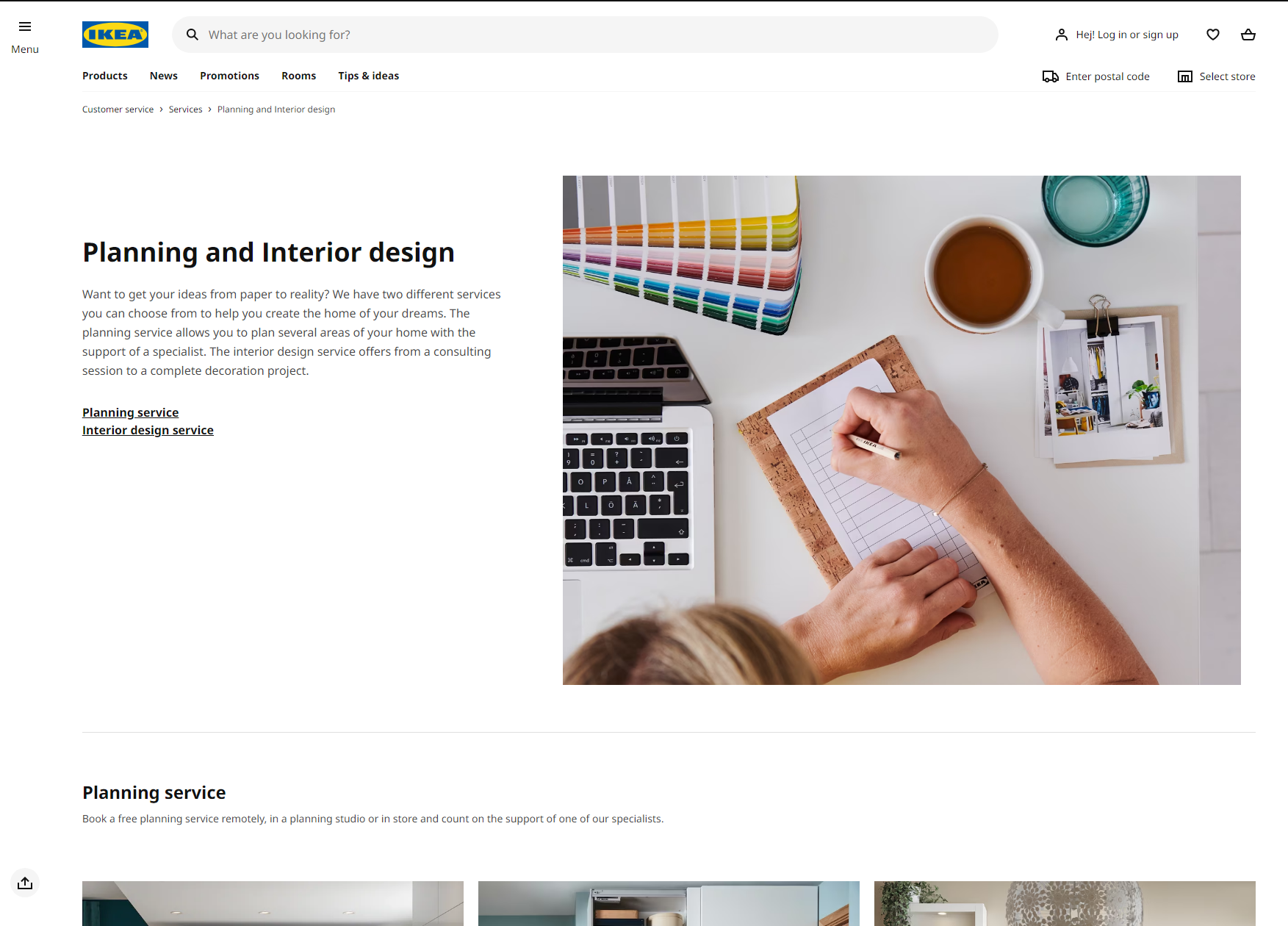
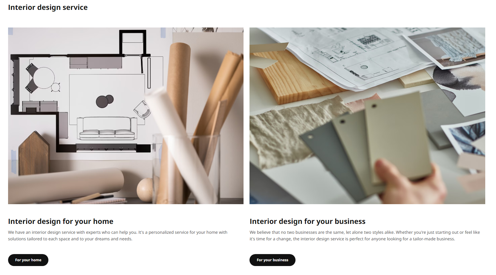
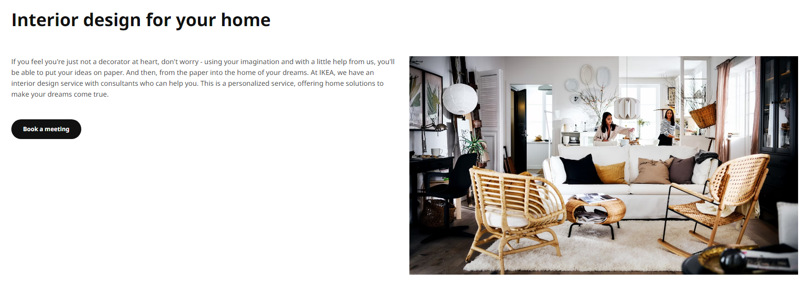
Many first renters or homeowners will shop at IKEA because of its pricing. They have their own interior designers where you can book an appointment with them and they will help you choose items to decorate your home.
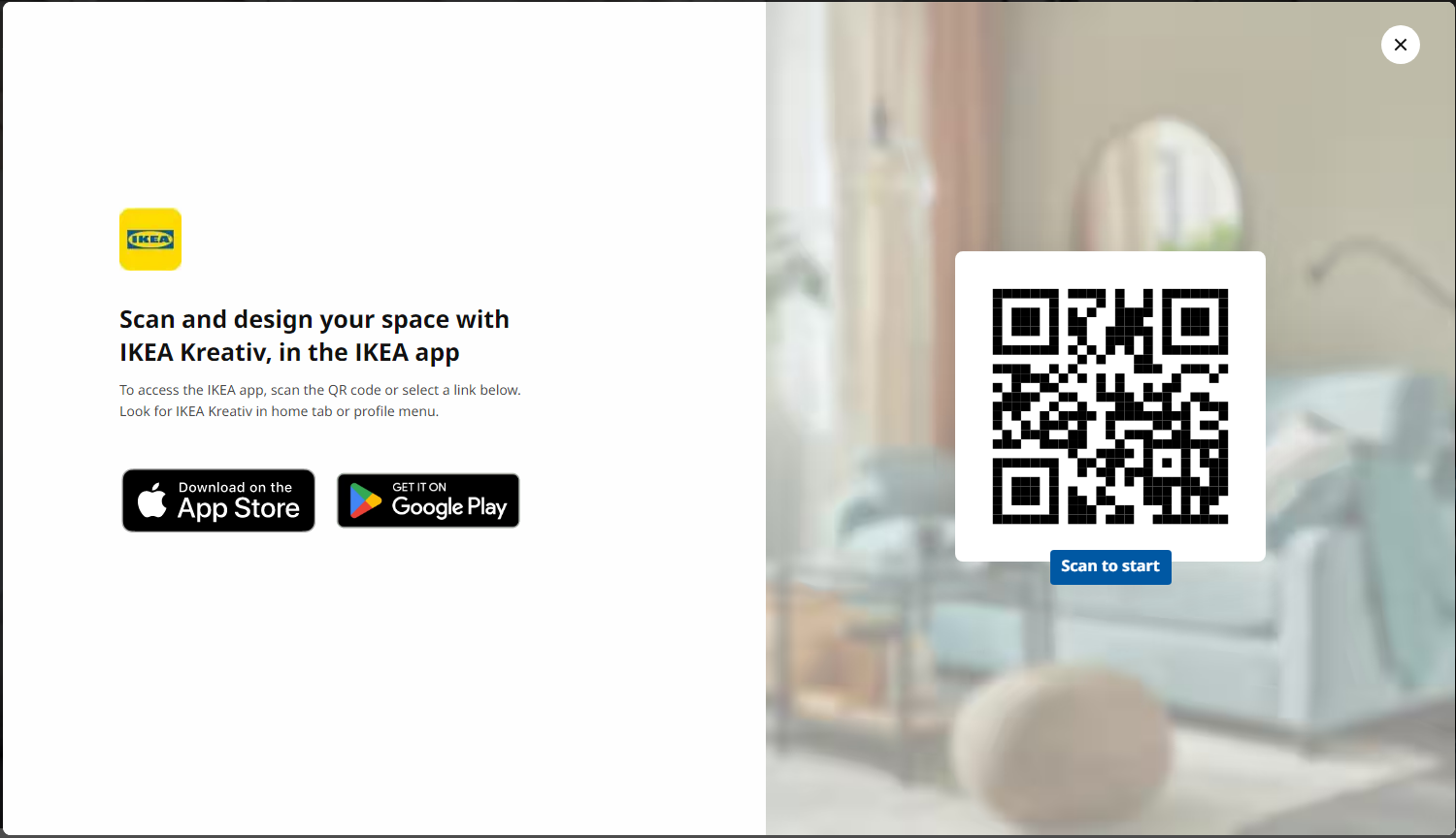
IKEA acquired Kreativ and the user would open their camera app and could interactively place items in the room. We would like to provide a service similar to it where users can actively interact with their camera and they are able to place items in the room (Augmented Reality).
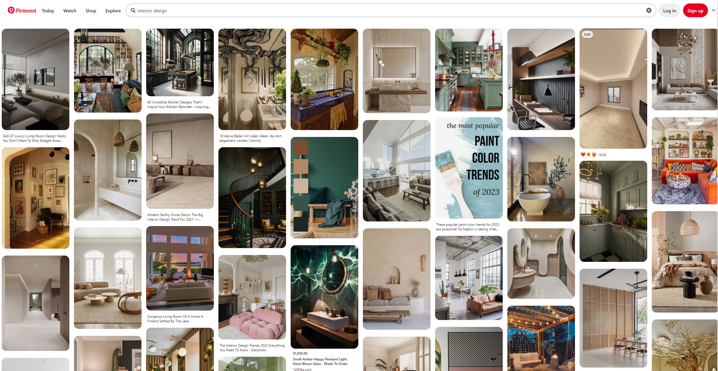
Many people use Pinterest to find inspiration. Pintrest works well because people can use specific words as tags. There is also a large community where many users come together to add to a large explore page. There is a large following and people can get inspiration for what theme or design that they would like.
After finding inspiration and looking at potential competitors, we are able to move onto the next step of day 2. We will now begin Crazy 8 sketches, eight sketches in eight minutes. These sketches were quick drafts of what the screens would potentially look like. With only one minute per sketch, we are able to gather many ideas in a short period of time, without going too much in detail.
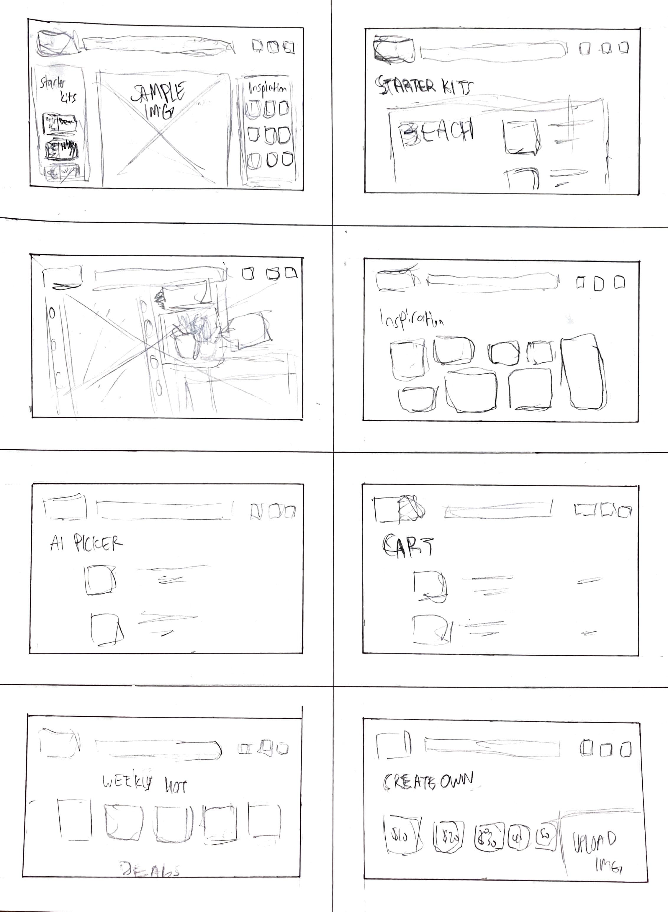
After finding inspiration and looking at potential competitors, we are able to move onto the next step of day 2. We will now begin Crazy 8 sketches, eight sketches in eight minutes. These sketches were quick drafts of what the screens would potentially look like. With only one minute per sketch, we are able to gather many ideas in a short period of time, without going too much in detail.
.png)
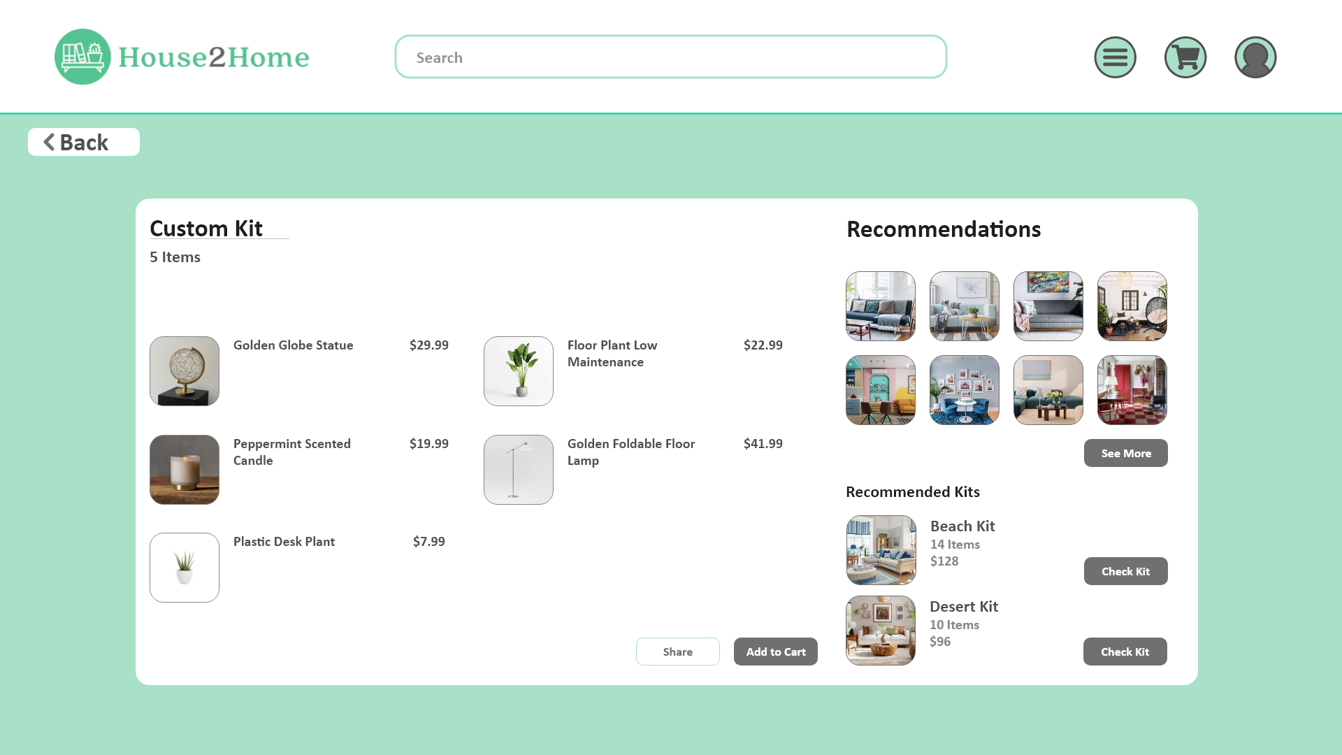
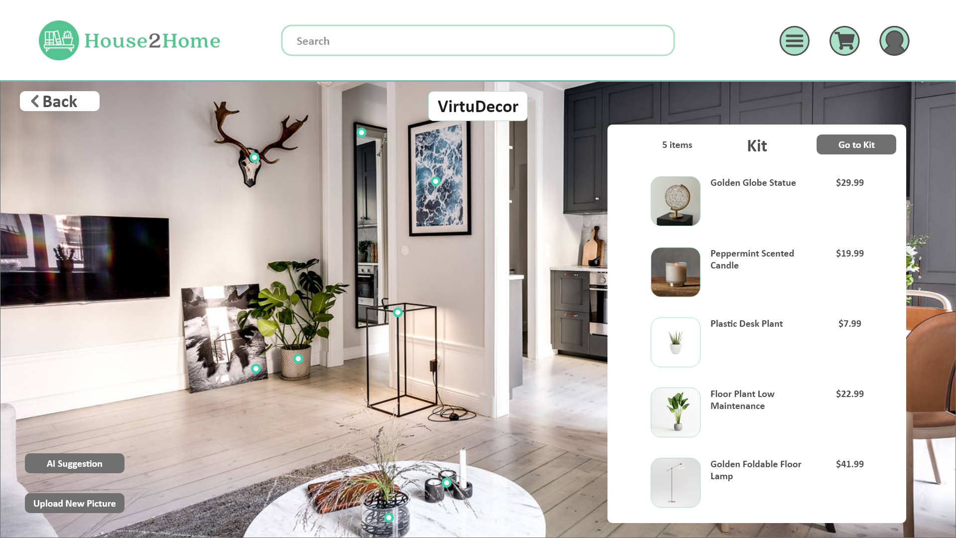
On day 3, we worked on creating a storyboard with ten sketches. In these ten sketches, we also included the solution sketch such as the "VirtuDecor," "Create a Kit," and "Custom Kit." The ten sketches gave us a general blueprint of what the pages should look like. These ten sketches are what we believe would best demonstrate the unique features offered by House2Home.
.png)
After gathering all the information and sketches, we are able to begin prototyping on day 4. We came up with 10 screens for our prototype, to match the number of sketches in our storyboard. Because of the time constraint, it is important that we created sketches that were detailed enough, as well as, informative enough where we can seamlessly create prototypes of them without losing much time.
Question: How might we help users find the perfect starter kit?
Question: How might we help users visualize their homes with the items?
Question: How might we help users find the perfect starter kit?
Question: How might we help users find inspiration for interior design?
Day 5 would be considered the final day of the design sprint. This is where we would gather 5 participants and conduct user interviews and testing. In the user interviews and testing, we wanted to figure out if there were any discrepancies when navigating through the application, from both an UX and UI standpoint. Although this would be considered the final day of the design sprint, the feedback received, would be incorporated into redesign and edits of the website.
These were the tasks given in the usability testing. We felt that these were important red routes for users to navigate through to see the full features of the website.
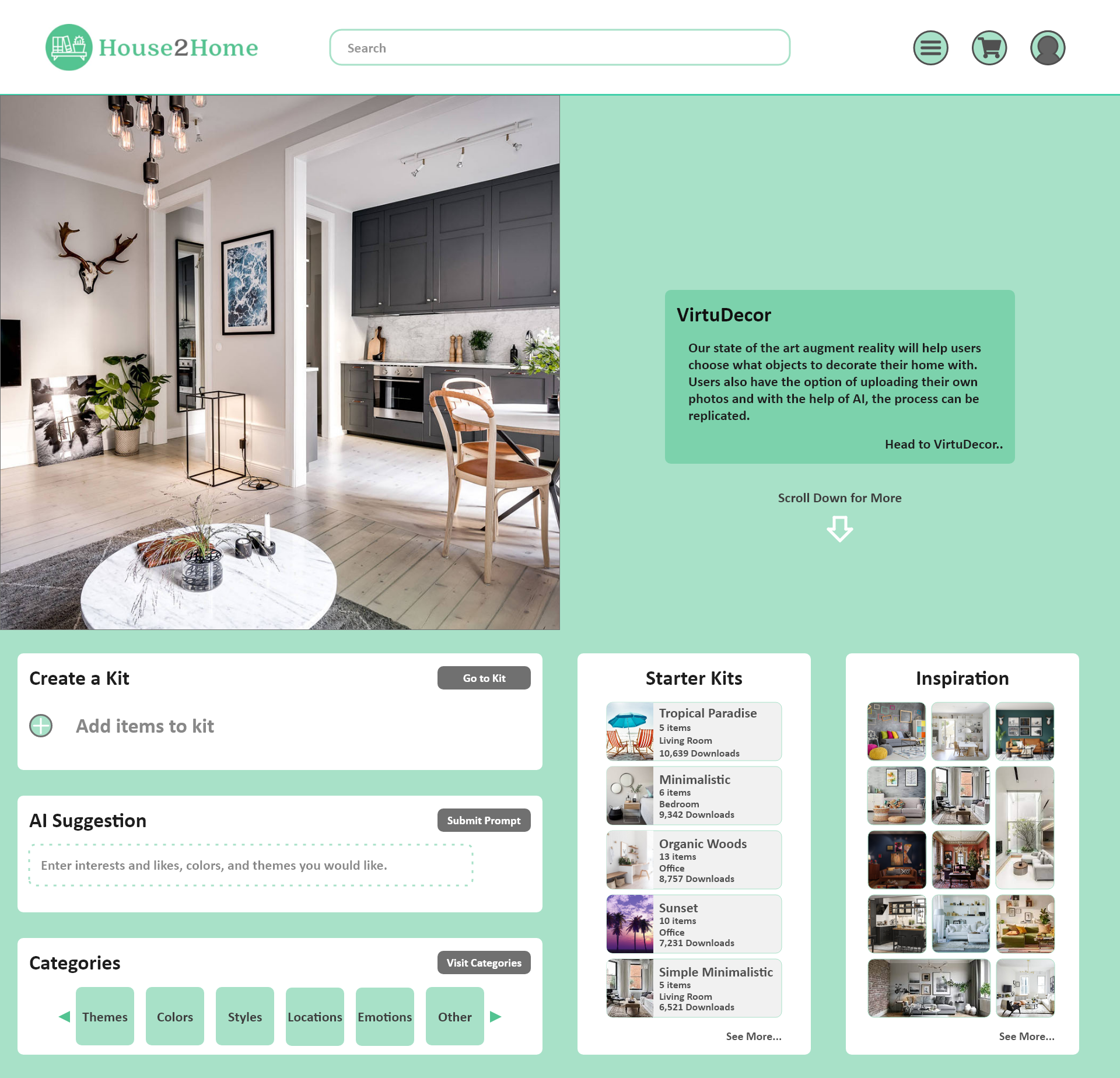
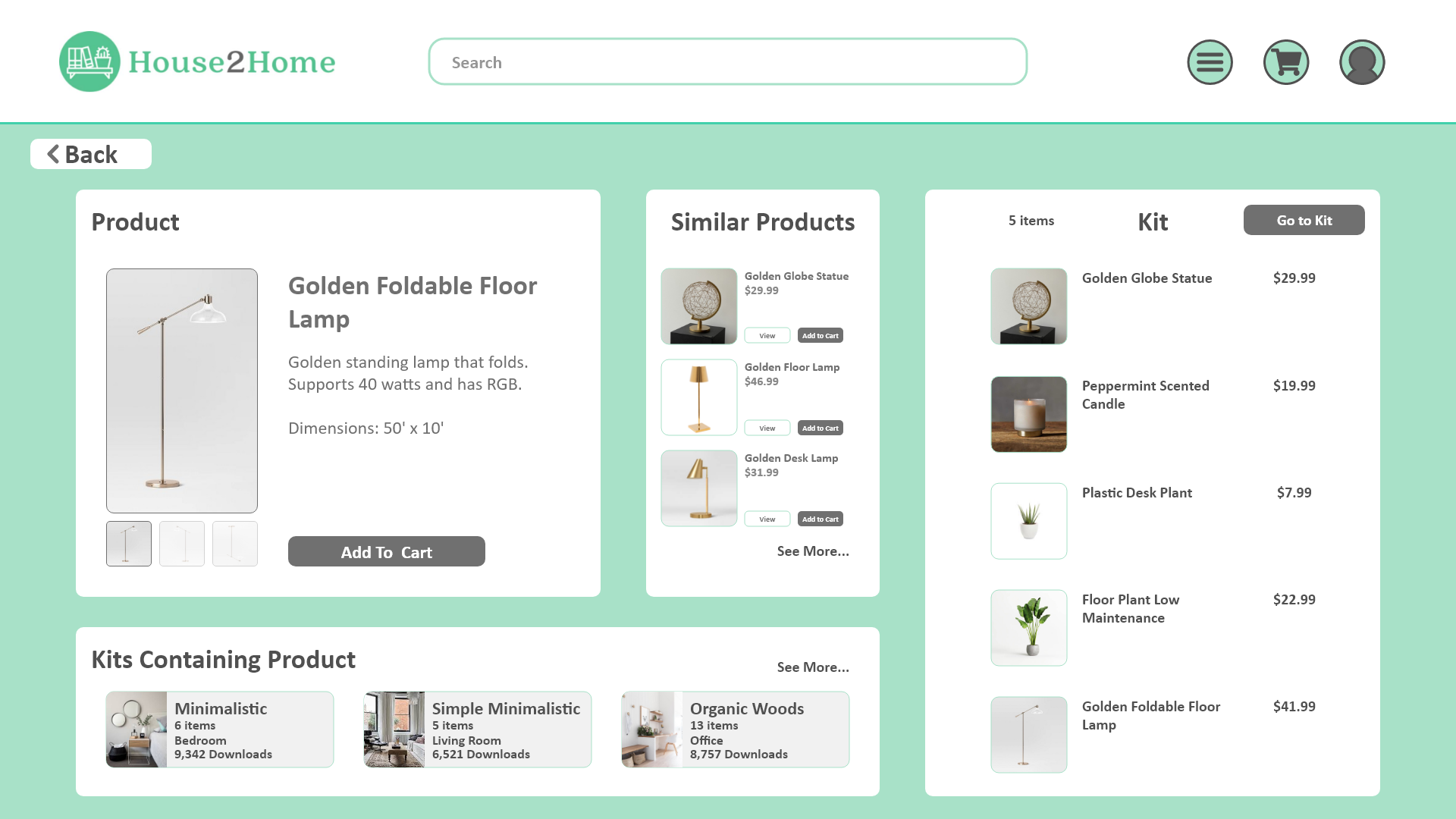
When conducting the testing, some issues that participants discussed were concerning navigation and a lack of direction. Participants struggled to reach certain pages sometimes and were really struggling with navigation throughout the whole website. Participants also discussed having a back button where they can click to navigate to the previous page. Some other edits were to eliminate the stenciled background and replace it with a solid color. There were also changes made to both the color of the background and the color in buttons and texts. Although there were not many comments about the visual aspects of the website, it is still important for us to make sure the website is easily accessible to anyone. The color change was to ensure that most people can see all the colors on the screen and to make sure that buttons and text are easily distinguishable.
This design sprint was an interesting challenge that really pushed our skills and knowledge within a short time period. It was also a challenge just trying to condense everything into a day, and making sure that no time was wasted and we could streamline the whole process. We also learned a couple more things from this project that we have to take into consideration for future projects. This was also the first time we used Adobe XD, we wanted to tryout the application in order to expand our skills. We learned the basics of the application and were able to complete the prototyping without too many issues.
From our previous project, we wanted to include more artwork. But sometimes, it might be too much and it might divert the users attention from the important features. It is important to maintain a balance between everything in order to create an ideal project.
Users will sense that there is no sense of direction on an application or website, this will lead them to getting frustrated and that is not what we want. It is important that pages help guide the users with text, image, and other forms of communication. Our goals is to help the user by creating a website or application to ensure that they have the most convenient experience when reaching their goal or task.