Cura Dental
A dental website built like the appointment card a front desk hands you, so booking is never more than one tap away
- Type
- Website Redesign
- Role
- Designer / Digital Marketer / Developer
- Timeline
- 2026
- Team
- Solo
- Stack
- Python static-site generator · HTML · CSS · JS
- Status
- Client project
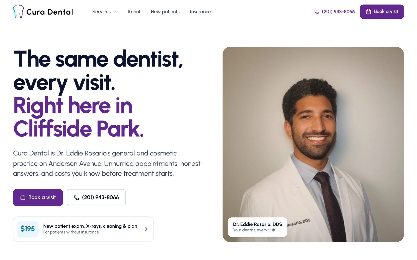
Cura Dental is Dr. Eddie Rosario's general and cosmetic practice on Anderson Avenue in Cliffside Park, NJ. I audited the old site, then designed and built a 24-page replacement around one job: turning an anxious first-time visitor into a booked patient. The concept, "The Appointment Card," prints the site in the logo's two inks and puts a working booking card right in the hero.
The same dentist, every visit. The website should say that first.
People choosing a dentist are usually comparing two or three practices on a phone in a few minutes, and they're quietly worried about two things: will it hurt, and what will it cost. The new Cura Dental site answers both before it asks for anything.
I was the designer, digital marketer, and developer. I audited the practice's existing Squarespace site, rewrote the structure around patient questions, designed a system from the logo's own colors, and built every page. Every fact on the site (prices, credentials, insurers, hours, reviews) comes from the practice. Anything they haven't confirmed yet, like a Google rating or offer expiration dates, is a flagged setting rather than an invented number.

What was wrong with the old site.
I don't have screenshots of the original site, so this is the written audit I did before designing anything, walking it as a first-time patient on a laptop and on a phone.
- Critical
Nowhere to actually book.
There was no booking form and no online scheduler. Contact meant a phone number, an obfuscated email, and "Learn more" buttons, with no click-to-book on mobile.
How I solved itA booking path on every screen: the header button, a working appointment card in the hero, a sticky card beside every service page and blog post, and a Call / Book bar fixed to the bottom on phones.
- Critical
Pages showed the wrong content.
The Root Canal and Emergency Dentistry pages displayed Oral Surgery copy, and even their page titles said "Oral Surgery." An emergency blog post's prevention section contained teeth-whitening text.
How I solved itRewrote all eight service pages from the practice's own copy, corrected, each following the same outline so a mistake like that would stand out.
- Major
The strongest trust signals were buried.
Dr. Rosario's real headshot appeared only on the About page, the hero used an AI-generated stock smile, and reviews scrolled past in an endless ticker that was hard to read.
How I solved itPut Dr. Rosario's real photo and credentials in the first screen, and gave reviews a calm, readable section that rotates on its own.
- Major
Search signals were weak or duplicated.
Blog URLs ended in random strings like "-96zrw", two financing pages duplicated each other, and there was no structured data for hours, FAQs, or the practice itself.
How I solved itKeyword-led titles, clean URLs with 301 redirects, and full schema markup (more in the SEO chapter).
- Minor
Three typefaces and no system.
Urbanist for headings, Poppins for body text, and Helvetica in places.
How I solved itOne typeface (Urbanist) and a documented token system, viewable on the site's own design-system page.
Skills used — Heuristic evaluation · Content audit · Technical SEO audit
The Appointment Card.
The practice's logo is a single-line tooth drawn in two inks, cyan and purple. I built the whole site from that: white card stock, those two printed inks, navy text. The signature element is a real appointment card in the hero. Pick a reason, a day from the practice's actual hours (Wednesday shows as closed), and a time, and the card writes a "Your visit" line, then opens the request form already filled in.
What should a first-time visitor see first on the homepage?
Why: Nearly every local practice offers the same services, so a service grid doesn't help anyone choose. What Cura offers that a chain can't is that Dr. Rosario sees you every time. The headline says exactly that ("The same dentist, every visit"), his real photo backs it up, and the $195 new-patient price and booking card sit right beside it.
Booking is one tap away
On every page and every screen size, with Call as the primary action on the emergency page.
Prove it with specifics
The dentist's name, his training, real prices, real quotes. Never invented stats.
Reduce anxiety
Say exactly what will happen, what it costs, and how long it takes.
Calm over clever
Motion and visuals only where they build trust or make something clearer.
Skills used — Art direction · Brand application · Interaction design
Two directions I threw away first.
My first version used warm terracotta and an editorial serif. It looked polished, but it didn't match the brand at all (the logo is cyan and purple), it recycled the old site's generic headline, and most of its images were grey placeholders. The second used a porcelain base with a deep violet accent. Closer, but it still read as "a nice dental template" rather than this practice, and it moved every URL, which would have thrown away the rankings the practice already had.
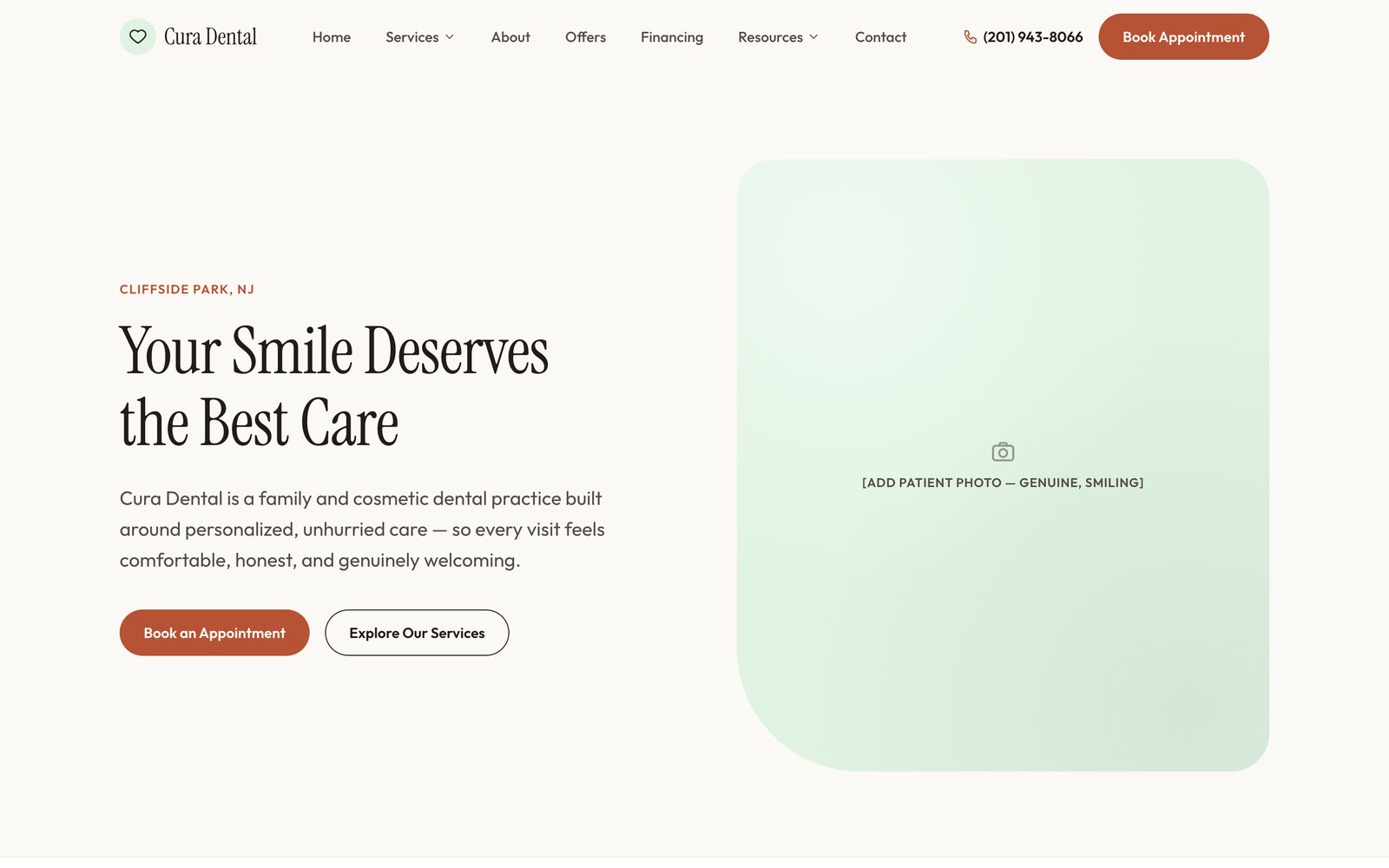
Direction 1: terracotta and serif. Off-brand, and leaning on the old copy.
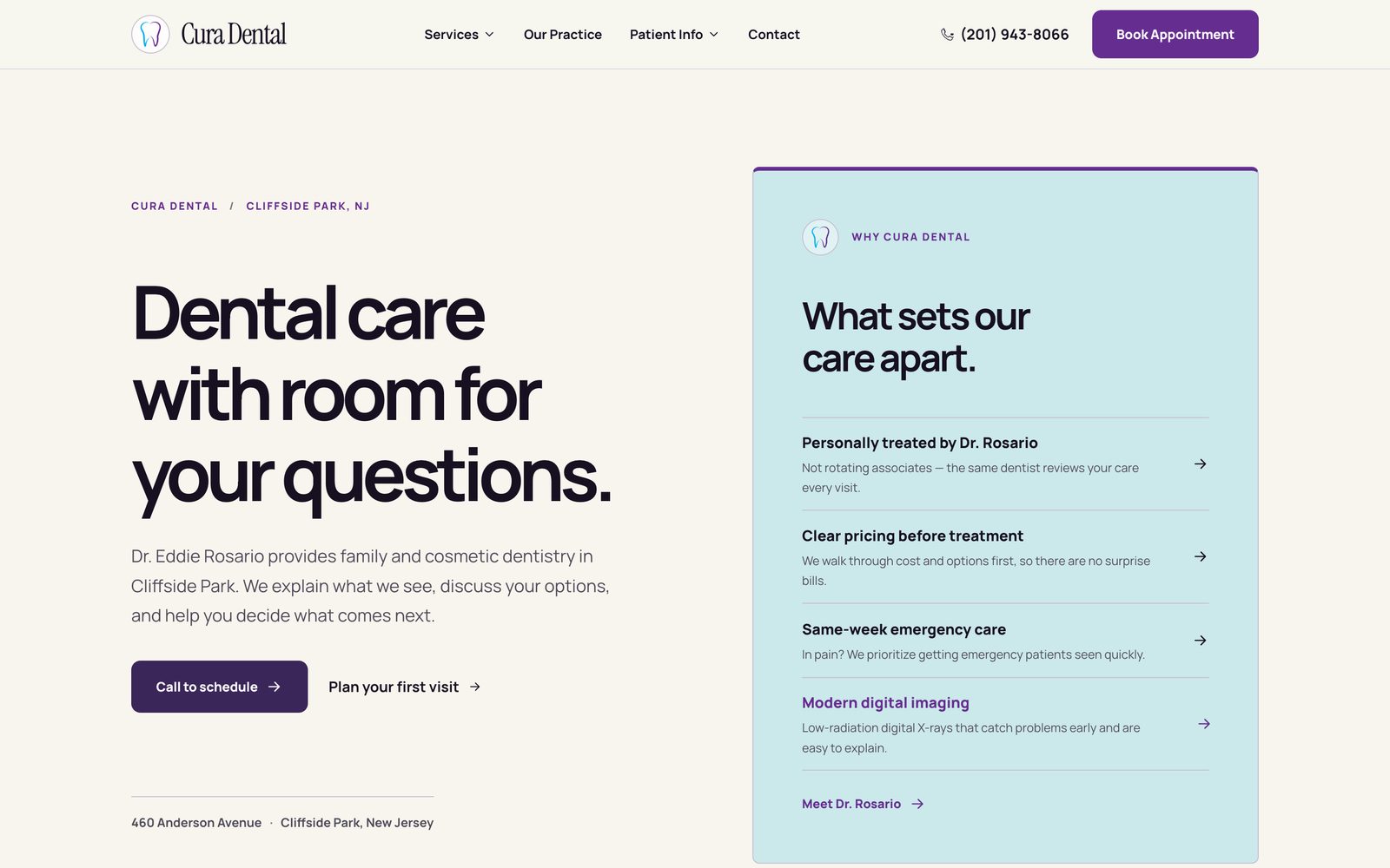
Direction 2: porcelain and violet. Cleaner, but generic, and it broke every existing URL.
Final: the logo's two inks, Dr. Rosario front and center, and a booking card in the first screen.
Both early directions were designed around how the site should look. Neither started from the brand the practice already had or the rankings it had already earned.
Uses the logo's real colors, keeps the live URL slugs, and builds the page around the one thing competitors can't copy: the same dentist at every visit.
Skills used — Visual exploration · Self-critique against goals
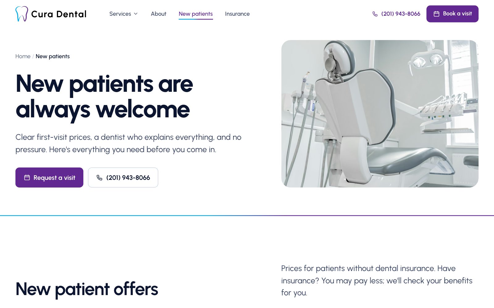
Every page ends in a way to book.
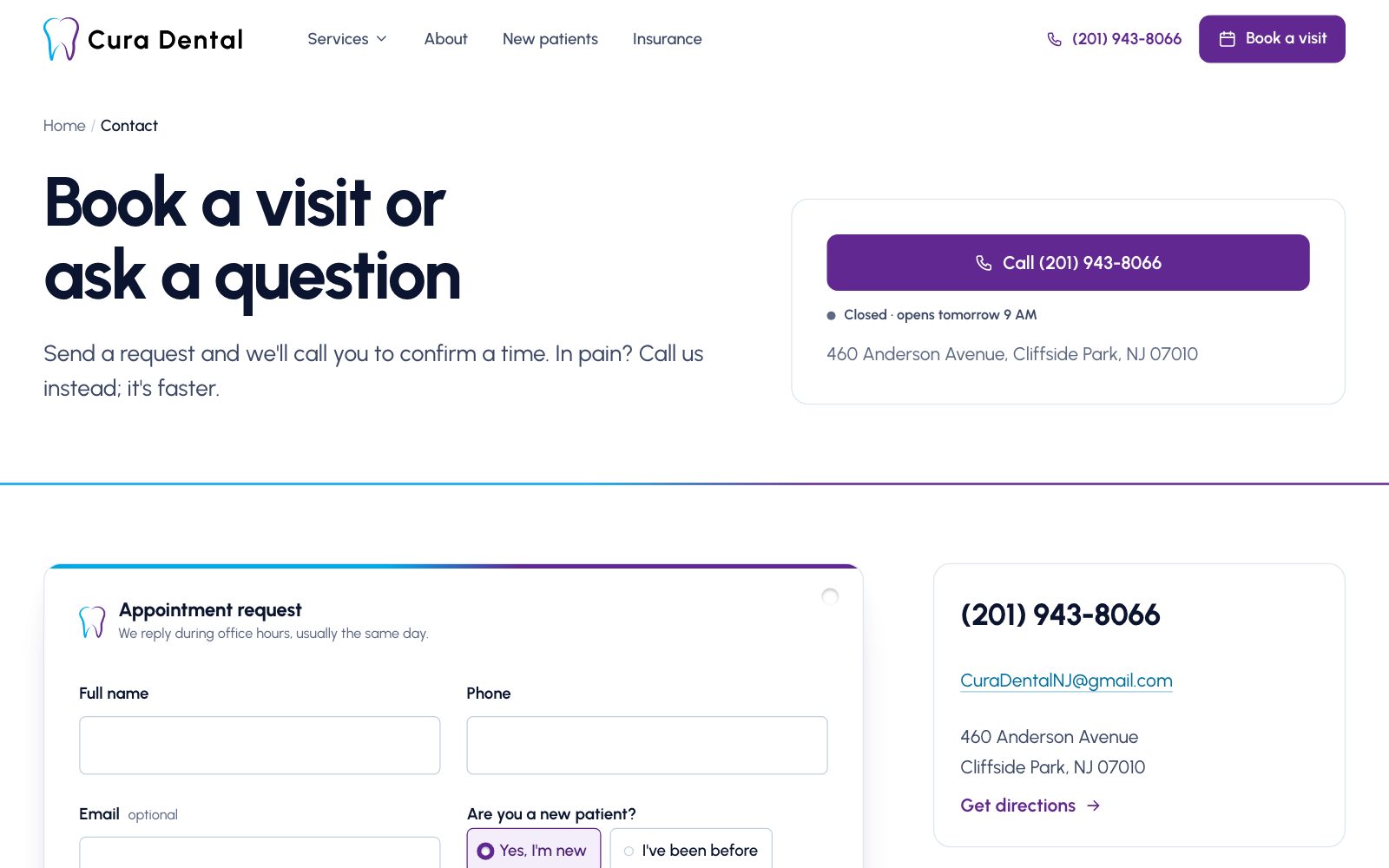
- A live "Open now · until 5 PM" status, calculated in New York time, so visitors know whether a call will be answered
- A request form that reads the reason, day, time, and offer from whatever link opened it, validates in plain language, and shows a "Requested" stamp when it's sent
- Offers designed as tear-off coupons ($195 new-patient visit, $495 Zoom! whitening) that link straight into the form
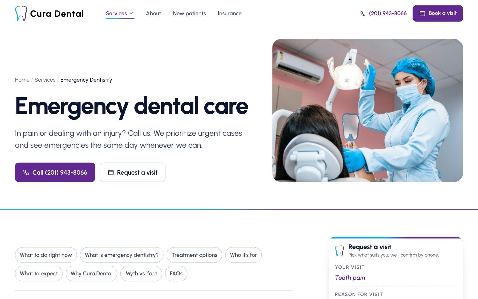
- On the emergency page, Call comes first and first-aid steps come before anything else
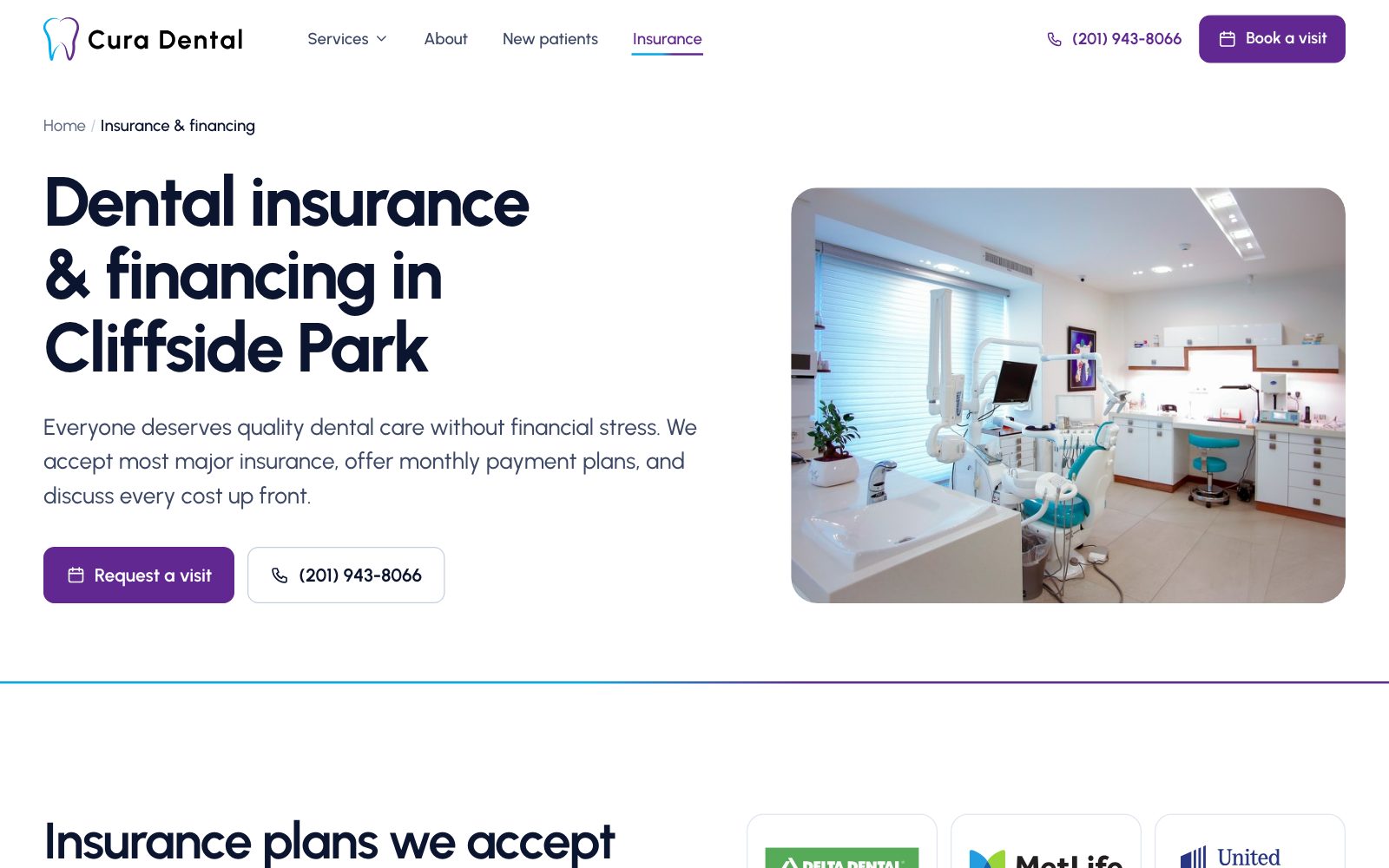
- Insurance and financing on one page: all nine insurers, Cherry, CareCredit, HSA/FSA, and the 10% Community Heroes discount
Skills used — Conversion-focused design · Form design · UX writing
Keeping the rankings the practice already had.
Local search is how a dental practice gets new patients, so the rebuild had to improve search signals without losing any of the ground the old site had already won.
- Kept the live site's URL slugs (/cosmetic-dentistry/, /tooth-replacement/ and so on), and 301-redirected the seven URLs that had to change
- A unique, keyword-led title and description on every page, and one H1 that names the service and Cliffside Park where it reads naturally
- Structured data on every page: a Dentist profile with hours, prices, accepted payments, and nearby towns, plus MedicalProcedure, FAQPage, BreadcrumbList, and BlogPosting where they apply
- Every service links to three related services, and every blog post links to its service
- Local copy names the neighboring towns patients actually come from: Fort Lee, Edgewater, Fairview, Palisades Park and more

Skills used — Technical SEO · Schema.org structured data · Local search
Two inks on white card stock.
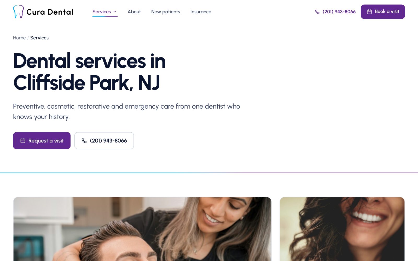
Purple carries headings and primary actions; cyan marks status and small accents; navy carries the text. Urbanist is the only typeface. The small details borrow from a real appointment card: chosen options get a punched-hole mark, the "Your visit" line writes itself in, and coupon stubs tilt as if they're being torn off. All of it stops for visitors who turn on reduce motion.
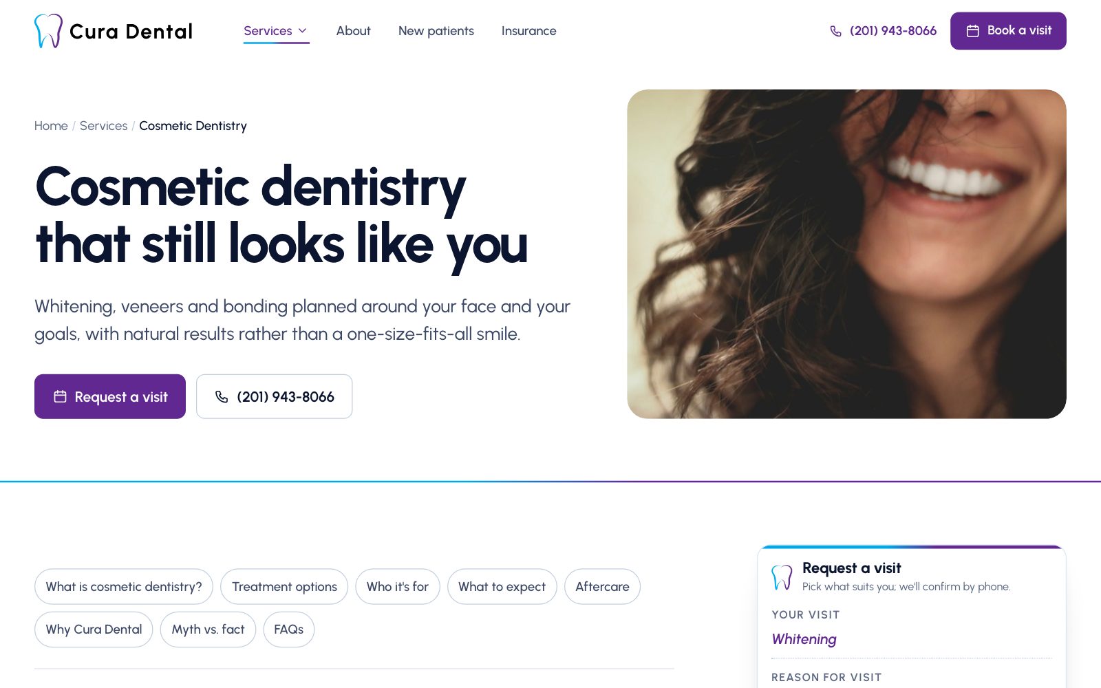
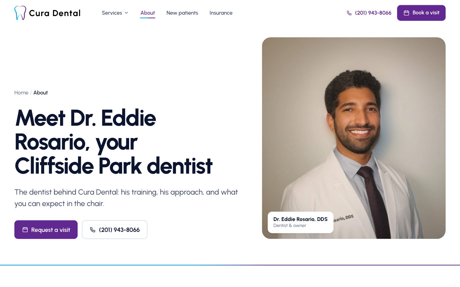
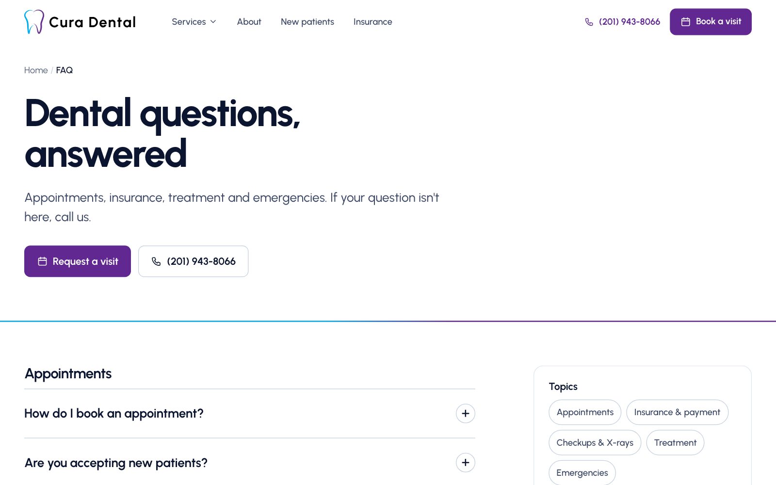
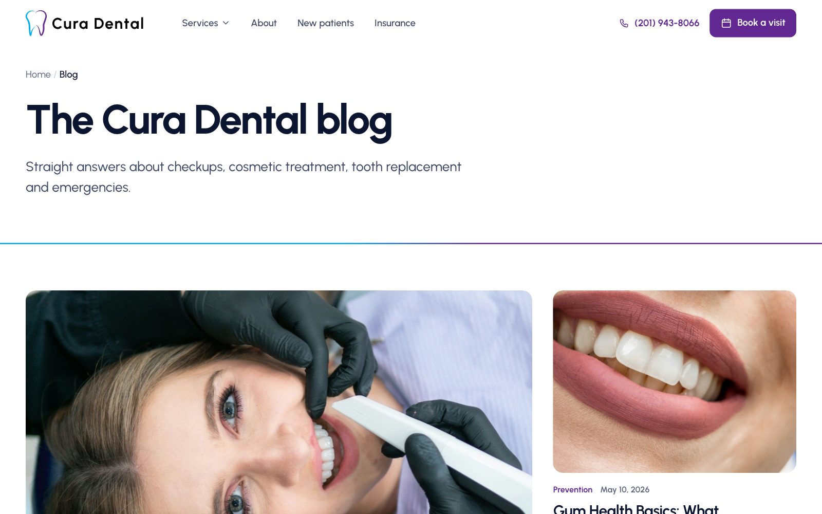
Skills used — Visual design · Typography · Design systems
Designed for someone in pain, on a phone.
Searches like "dentist near me" happen on phones, often while someone is already hurting. On mobile, Call and Request a visit stay pinned to the bottom of every page, tap targets are at least 44px, and type stays large enough for older patients to read comfortably.
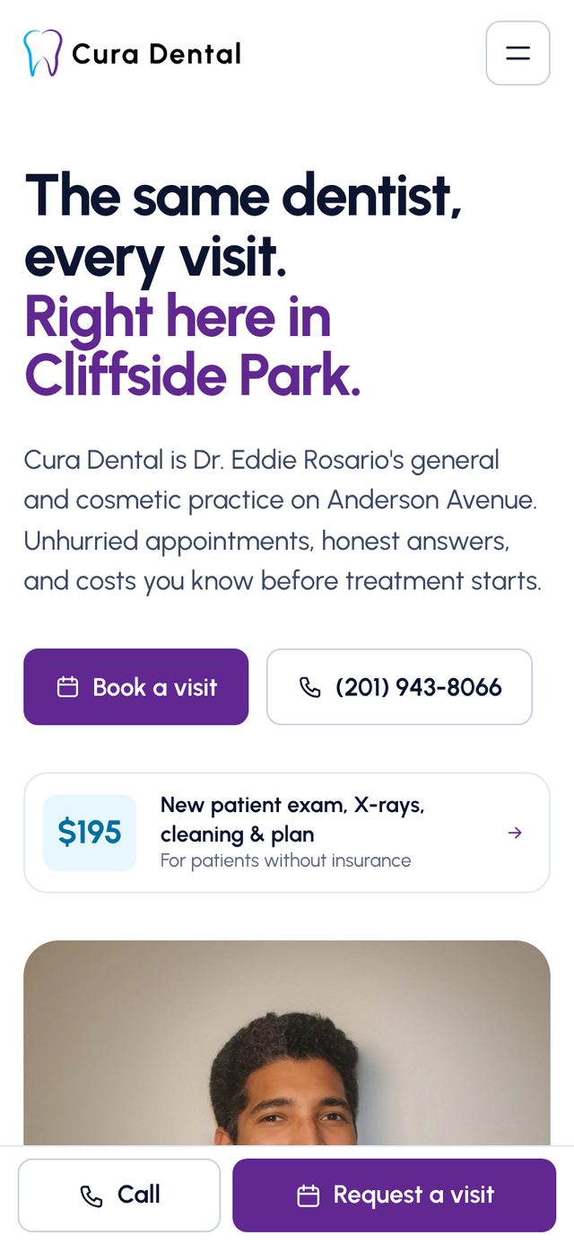
Home, with the pinned Call / Request bar
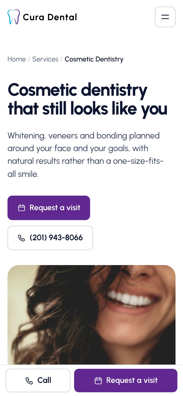
Service page
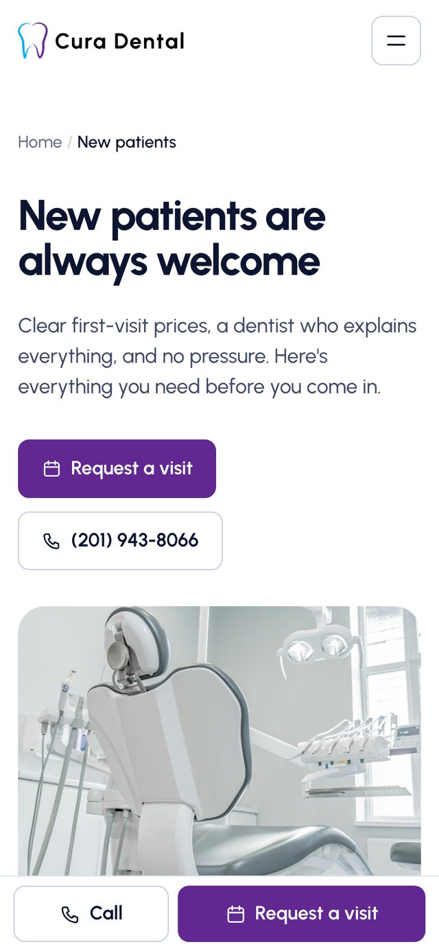
New patients
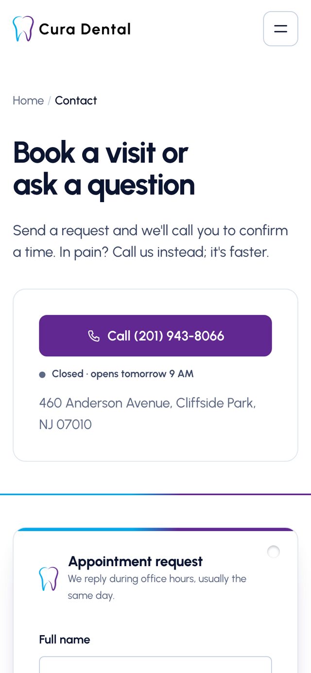
Contact and live office status
- Semantic HTML, a skip link, and visible focus states
- Responsive images in two sizes, lazy-loaded below the fold, with the hero image preloaded
- prefers-reduced-motion respected for every animation
- A dedicated accessibility statement page
Skills used — Responsive design · WCAG 2.2 AA · Touch-target sizing
A component system with no JavaScript framework.
The practice needs to update prices, offers, and reviews without a developer. What should the site be built on?
Why: Practice details, hours, services, offers, insurers, reviews, FAQs, and blog posts all live in one file. Reusable components (appointment card, coupon, timeline, FAQ) render it into plain HTML, CSS, and JavaScript that any host can serve for free, with no monthly CMS bill and nothing to keep patched.
The things the practice still needs to supply (an online scheduler link, a form endpoint, a verified Google rating) are single settings in that file. Set the scheduler URL, for example, and every "Request a visit" button on the site becomes "Book online."
Skills used — Front-end development · Python static-site generation · Content modeling
A site that matches the practice's real reputation.
- 24 pages organized around the questions new patients actually ask
- A way to call or book on every page, pinned on mobile
- Real prices, insurers, and financing up front instead of buried
- Wrong and duplicated content fixed, existing URLs kept, and full structured data added
- One content file the practice can update without touching layout code
This is a client project, so I'm measuring it against the goals we set rather than a controlled experiment. Once it's live, the plan is to track calls, form requests, and organic traffic, and to check Google Search Console two weeks after launch for any 404s from old URLs.
What I learned.
Start from what the client already has
The logo's two colors and the URLs already ranking on Google were worth more than any new idea. Both of my discarded directions ignored them.
One specific promise beats a feature list
"The same dentist, every visit" does more work than any grid of services, because it's the one thing a chain down the road can't say.
Leave honest gaps
A missing Google rating is a setting waiting to be filled in, not a number to invent. That makes the site easy to trust, for patients and for the client.