Wise Clock Cafe
Turning a beach café's photo-album website into one that sells both the boardwalk stand and its pop-up business
- Type
- Website Redesign / Brand Experience
- Role
- Designer / Developer
- Timeline
- 2026
- Team
- Solo
- Stack
- React · TypeScript · Vite · Tailwind
- Status
- Client project
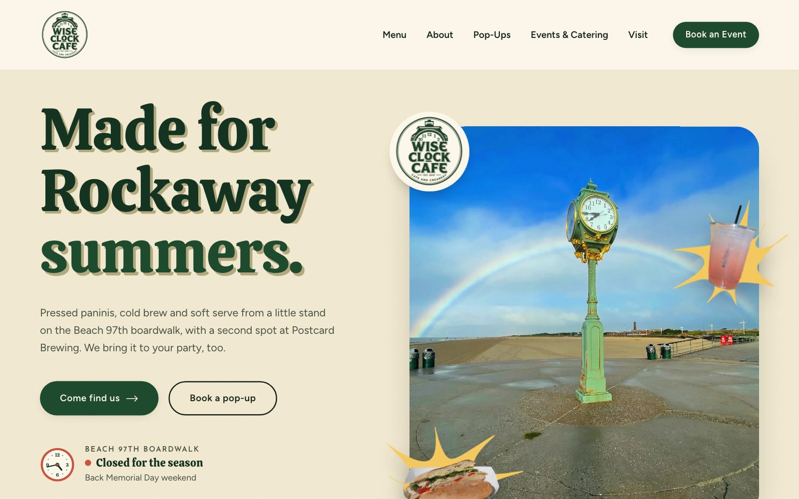
Wise Clock Cafe and Creamery is a beach stand on the Beach 97th boardwalk in Rockaway Park, Queens, started in 2018 by friends Alex Moule and Nick DePrima, now with a second spot at Postcard Brewing. Their current website is a logo and a wall of photos. I redesigned and rebuilt it from the café's own badge, so it tells beachgoers where to go and whether it's open, and tells event planners they can book the café for their party.
A café with real character and a website that didn't show it.
Wise Clock already has a genuine identity: a clock-tower badge marked "EST. 2018," a hand-chalked surfboard sign, and a spot next to the famous green clock on the Rockaway boardwalk. The website just never said what the café was, where it was, when it was open, or that you could book it.
I was the designer and developer. I audited the live Wix site, defined who the new site is for, organized the content around those two visitors, and designed and built it in React, TypeScript, and Tailwind. Everything on it comes from the owners: their photos, their badge, their Summer menu PDF, and their real contact details.
A photo album, not a website.
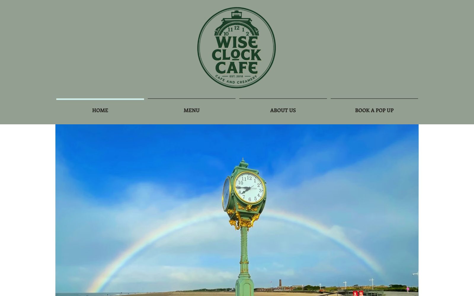
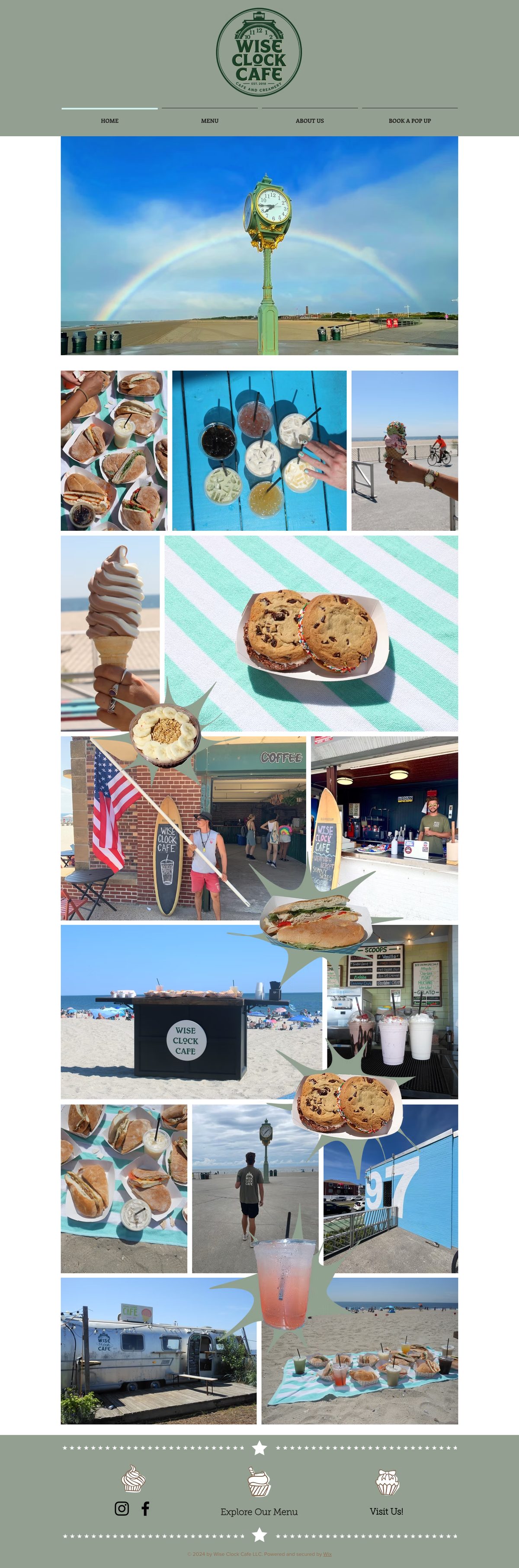
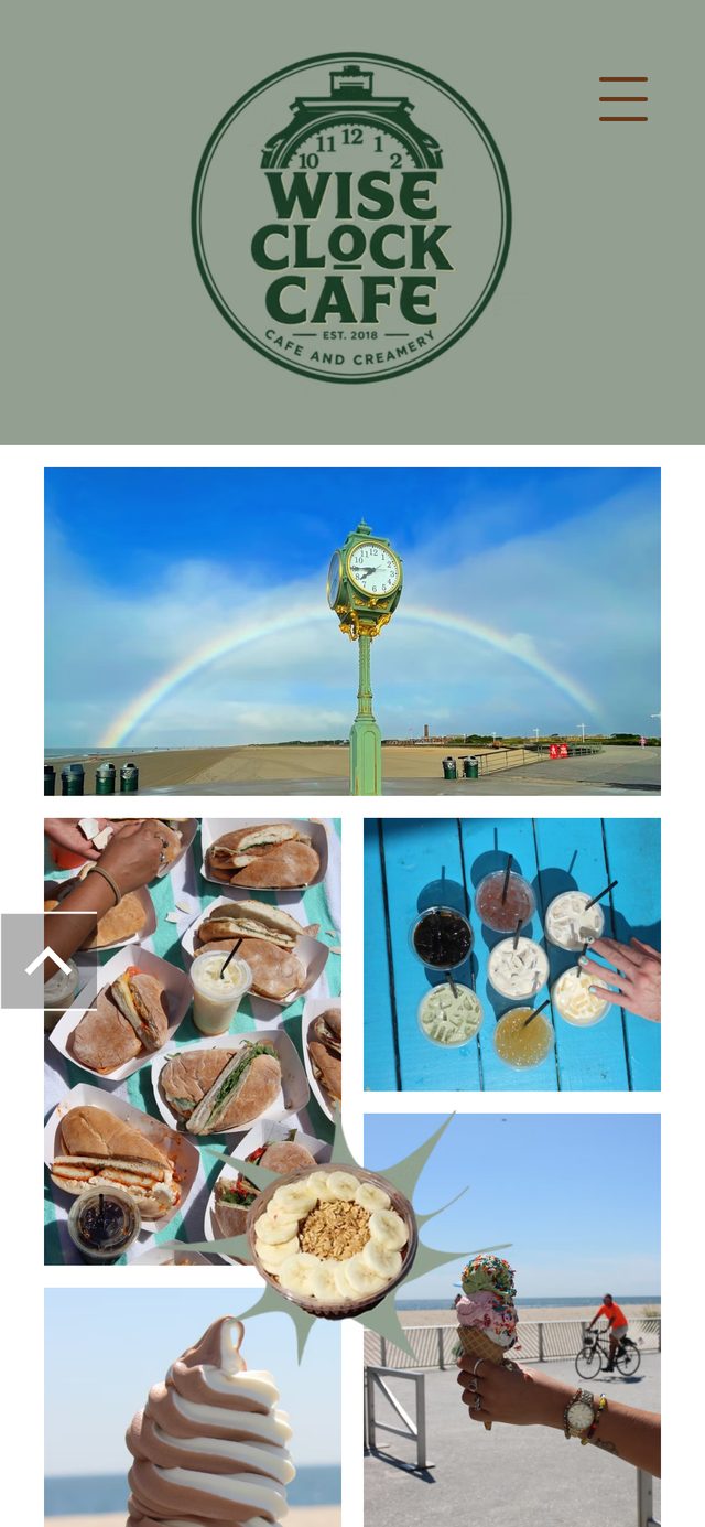
This is wiseclock.net as it's live today. I walked it twice, on a laptop and on a phone: once as a hungry beachgoer, once as someone planning a party. Drag the slider to compare it with the redesign.
- Critical
The homepage never says what the business is.
Below the logo is a grid of photos: no headline, no description, no address, and no hours.
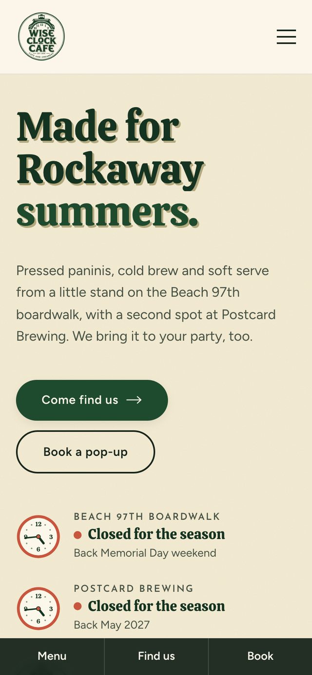
How I solved itA headline and a one-line description ("Pressed paninis, cold brew and soft serve from a little stand on the Beach 97th boardwalk"), then Come find us and Book a pop-up.
- Critical
No way to tell if it's open.
A seasonal beach stand lives or dies on hours, and they aren't published anywhere on the site.
How I solved itA live hours clock for each location that shows open, closing soon, or closed for the season, with today's opening window drawn on the dial.
- Major
The pop-up business is a single tab.
Coffee, panini, and ice cream pop-ups are a real revenue line, but only a "Book a Pop Up" tab points to them.
How I solved itPop-ups and events each get their own page, a full homepage section, and a "Book an Event" button that never leaves the header.
- Major
Menu and directions sit at the very bottom.
"Explore Our Menu" and "Visit Us!" only appear as small icons in the footer, below roughly twenty photos.
How I solved itMenu and Visit in the main navigation, a readable on-page menu, and a pinned Menu / Find us / Book bar on phones.
Skills used — Heuristic evaluation · Content audit · Mobile usability review
A beachgoer and an event planner want opposite things.
Standing on the boardwalk on cellular data, deciding where to eat in the next ten minutes. Needs the menu, the location, and whether it's open, within seconds and within thumb's reach.
Planning a birthday, a school event, or a company outing weeks ahead. Needs to believe the pop-up business is serious, see what each option looks like, and send an inquiry.
One homepage has to serve both. Who gets the first screen?
Why: Most visitors are beachgoers deciding right now, and the stand is what people know. Planners are fewer but more deliberate: they'll scroll. So they get "The cafe doesn't always stay put," a dark section that's impossible to miss, plus a Book an Event button in the header on every page.
Two halves, one brand
The stands and the pop-up business get equal billing, never a homepage plus a buried "Catering" page.
Real over polished
Only the owners' own photos, food, and signs. No stock, ever.
Beach-phone first
Menu, directions, and booking always one tap away, and open/closed visible at a glance.
Never invent
Menu items, prices, and service lines only as the owners publish them.
Skills used — Audience segmentation · Information architecture · UX writing
My first redesign looked like a café. The final one looks like this café.
The first version used a sand background, a "Rockaway Blue" accent, and an editorial serif. It fixed the structure, but standing next to the café's real signage it felt borrowed. The badge is bottle green on cream with chunky sign-painter capitals, so the final design takes everything from it: pine green, Calistoga lettering with the sign's khaki drop shadow, small tracked caps like "CAFE AND CREAMERY," and the clock.
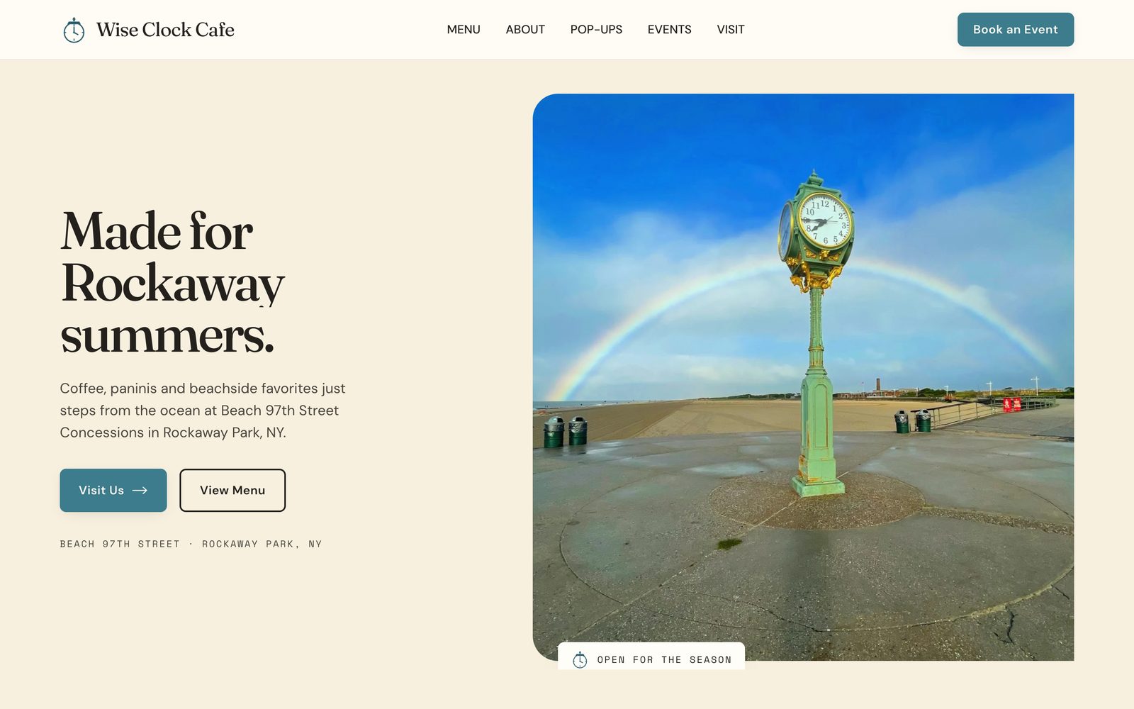
First redesign: right structure, but a generic coastal look.
Final: built from the badge, with live hours and the food on sunbursts.
The clock is the café's logo. Should it stay decoration?
Why: Hours were the most important missing fact, and the clock was the strongest brand device, so I combined them. Each location has a working clock face: the hands show New York time, the rim turns green when it's open, sun-yellow in the last half hour, and tomato red when it's closed or out of season. The footer ends on a line drawing of the boardwalk clock itself, with ticking hands.
Skills used — Visual exploration · Brand application · Self-critique against goals
Small interactions that answer real questions.
- "What are you craving?": tap Something iced, Something pressed, Something sweet, or Feeding a crowd, and it serves a real pick from the menu with its photo and price (or, for a crowd, a path to plan a pop-up), with a shuffle for another pick
- Two spots, same crew: the Beach 97th boardwalk stand and the new spot inside Postcard Brewing, each with its own hours clock and directions
- A full menu as real text, transcribed from the owners' Summer menu PDF, which stays one tap away to open or download
- An event inquiry form in three short groups (about you, the event, what you'd like) that checks dates, times, and phone numbers inline and puts the cursor on the first problem
- The café's own food cut-outs on sunburst stickers that spin in, and snapshot-style photo prints that straighten when you hover
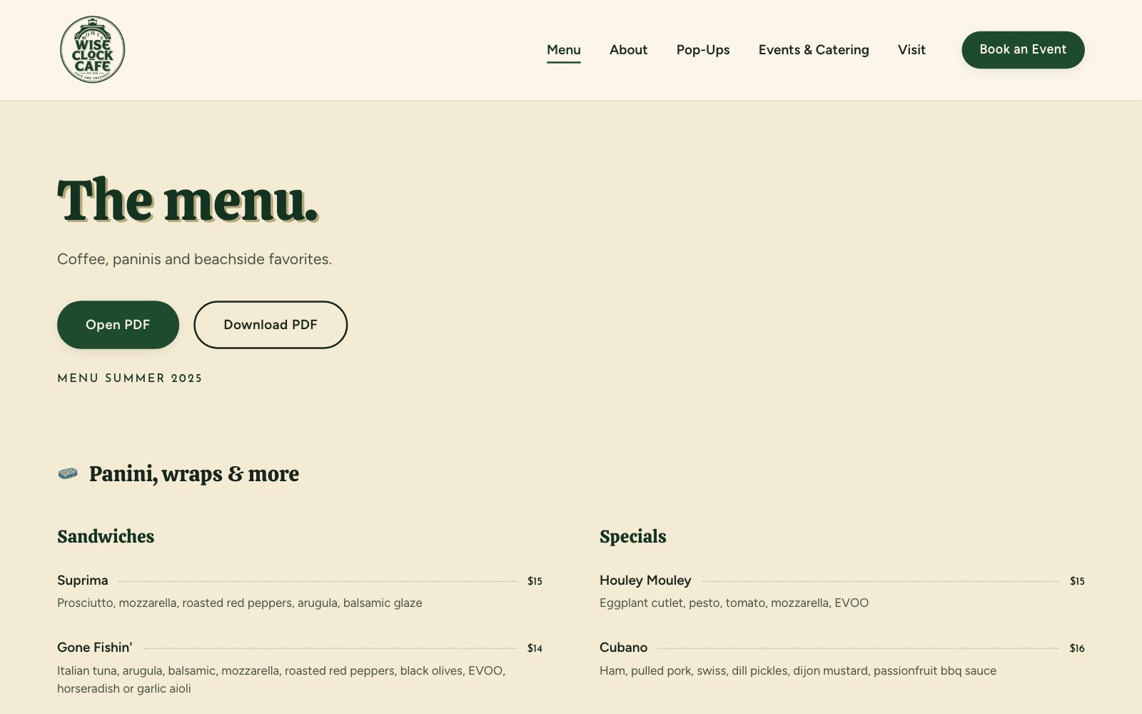
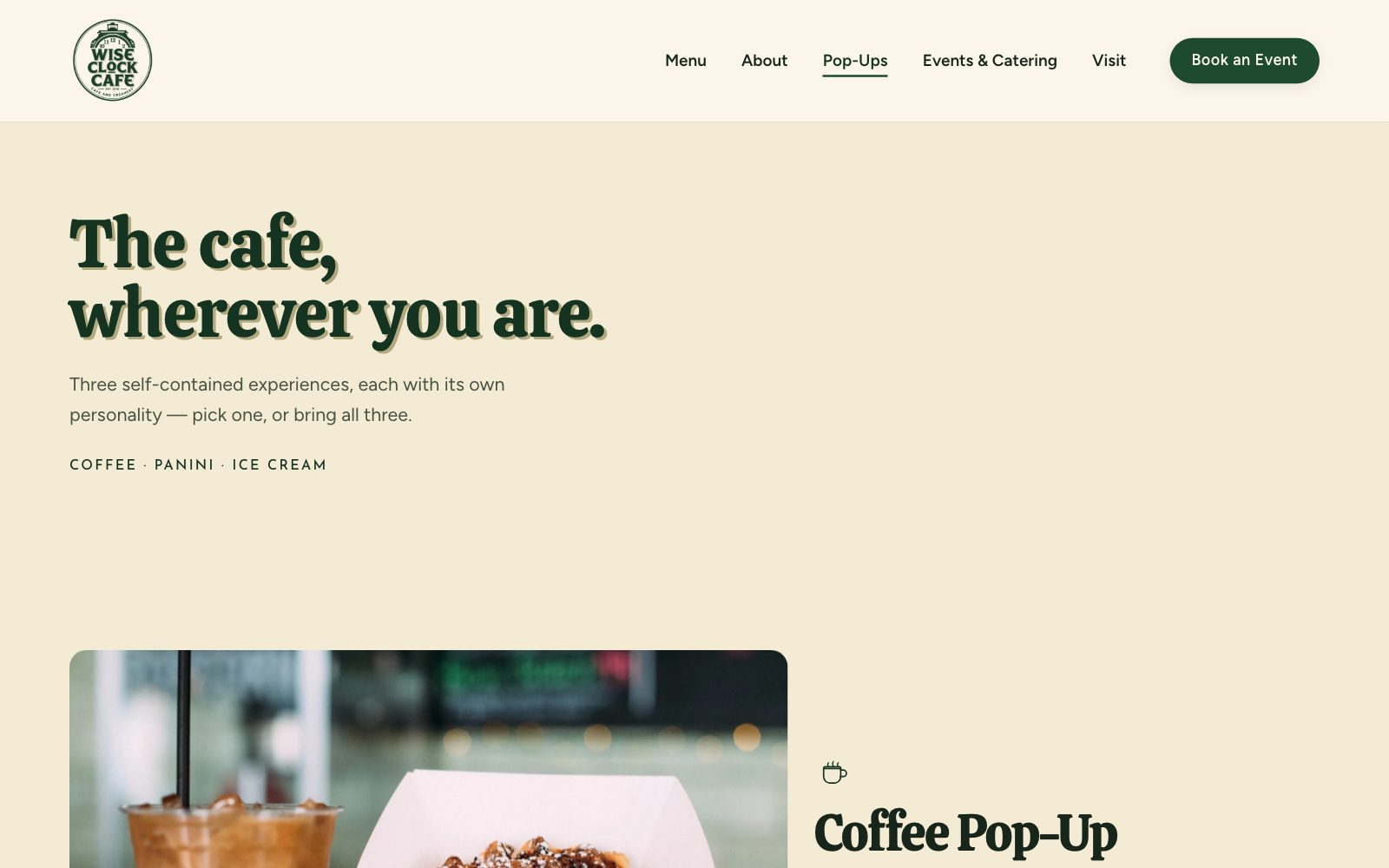
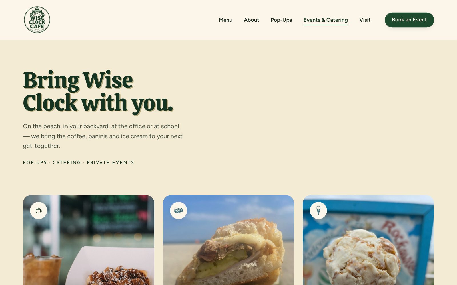
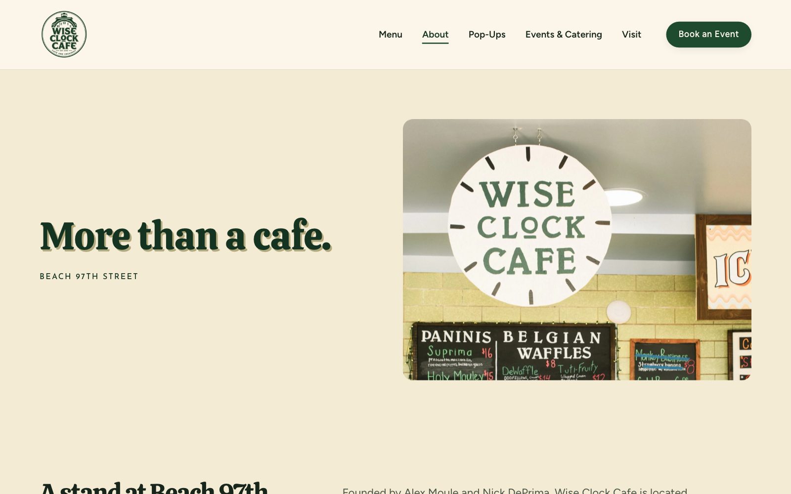
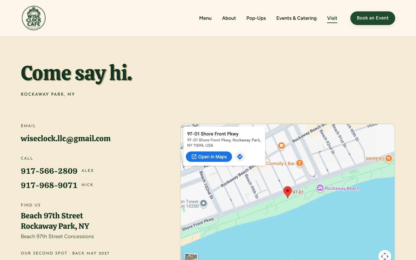

Skills used — Interaction design · Content design · Form design
Built for a phone on the boardwalk.
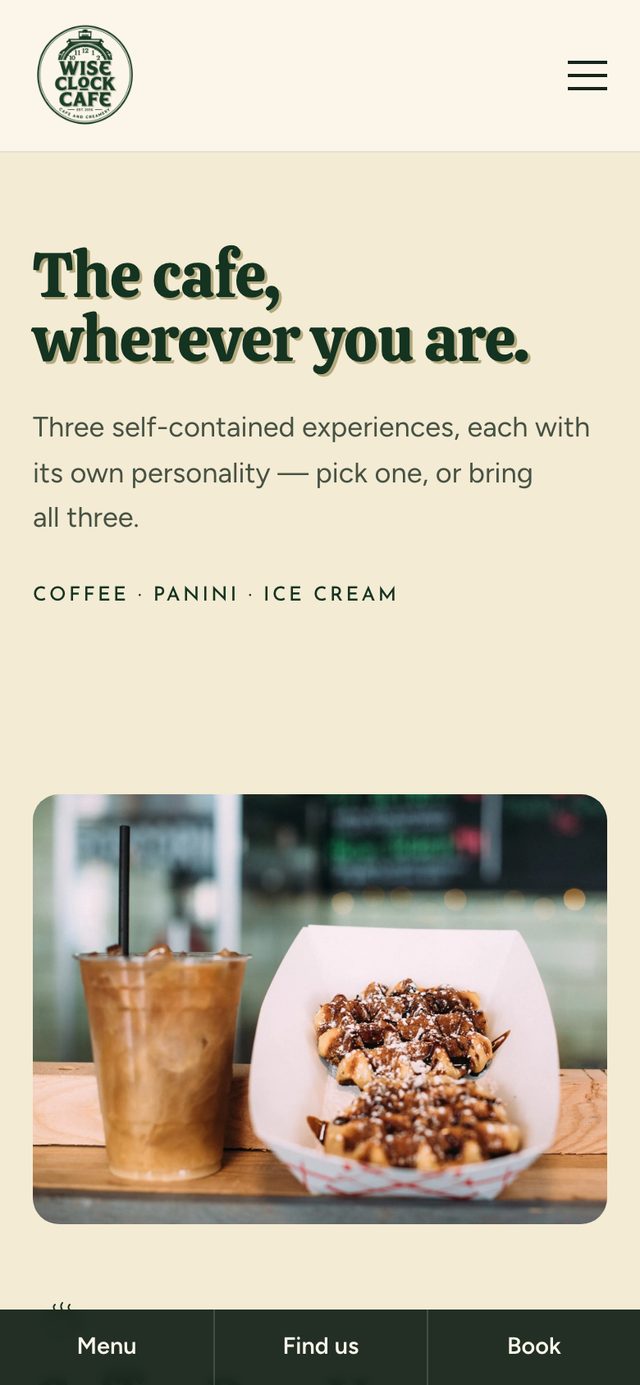
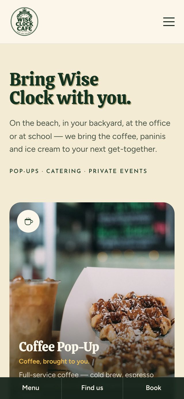
Most visitors check the site on a phone, outside, often in bright sun. A Menu / Find us / Book bar stays pinned to the bottom of every page, clear of the iPhone home indicator, because someone already standing on the beach needs those three things and nothing else.
Home, with both locations' status
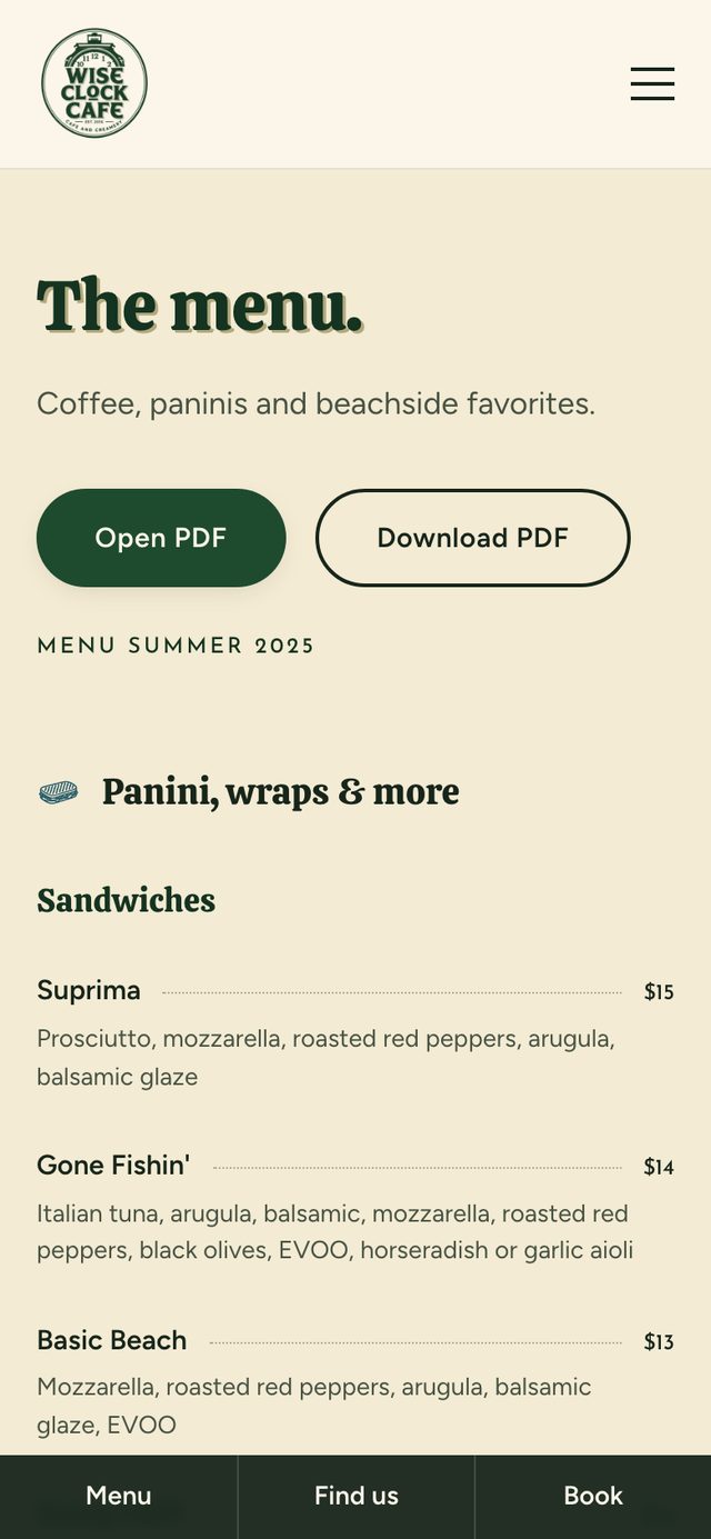
Menu
Pop-ups
Events
- Every tap target at least 44×44pt, and form inputs at 16px so iOS doesn't zoom in
- Green-black text on cream, never pure black, for comfortable reading outdoors
- Open/closed shown with words as well as color
- Everything animated collapses to instant for visitors who turn on reduce motion
Skills used — Responsive design · Apple HIG spacing · WCAG AA
A site the owners can keep up to date themselves.
Menus, prices, hours, and pop-up offerings change every season. Where should that content live?
Why: A seasonal café doesn't need a CMS bill. Business details, both locations' weekly hours and seasons, pop-up types, and the full menu live in two files, so a menu change or a new season is one edit, and the hours clocks update everywhere on their own.
I also built a hidden design-system page that documents every color, type style, and component, and lets the owners preview alternative font pairings live. The booking form is fully validated but deliberately not wired to a service yet. The owners chose to decide that later, and the README explains exactly how to connect it.
Skills used — Front-end development · React · TypeScript · Content modeling
A site that feels like the café and takes the pop-up business seriously.
- A first screen that says what, where, and whether it's open right now
- Pop-ups and events with their own pages, a homepage section, and a booking button on every page
- A readable menu transcribed from the owners' PDF, with the PDF still one tap away
- Menu, Find us, and Book pinned on every phone screen
- A visual identity taken directly from the café's own badge and photography
This is a client project, so I'm judging it against the goals set with the owners rather than a controlled experiment. Next: confirm the real weekly hours, connect the inquiry form, and track event inquiries through next summer's season.
What I learned.
Real assets beat invented ones
Recovering the café's own photos, badge, and food took longer than picking stock images, but it's why the site feels like Wise Clock and not a template with its name on it.
Let the brand's symbol do a job
Turning the clock logo into live hours clocks solved the site's biggest missing fact with the brand's most recognizable mark.
A good first version can still be wrong
My first redesign fixed the structure and still felt borrowed. Holding it up next to the real signage is what pushed the final design to come from the badge.